mirror of
https://github.com/vercel/commerce.git
synced 2025-07-05 20:51:21 +00:00
6.7 KiB
6.7 KiB
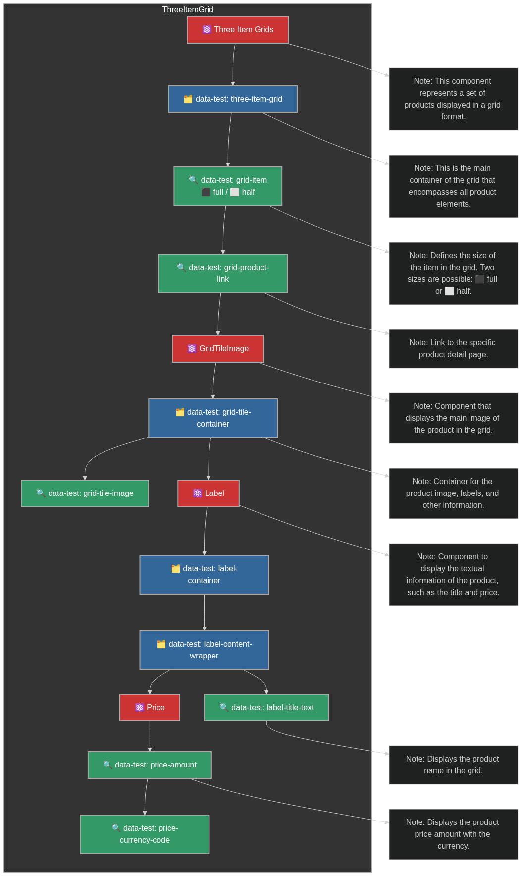
Conception des Tests
Hiérarchie des Composants et Attributs Data-Test
Home page
ThreeItemGrid Component
Voici un schéma Mermaid qui représente les composants et les hiérarchies des attributs data-test pour le composant ThreeItemGrid.
%%{init: {'theme': 'dark'}}%%

graph TD

%% Using a darker green (#339966) with white text (#fff) for better contrast
classDef grid-item-class fill:#339966,stroke:#aaa,stroke-width:2px,color:#fff;

%% Dark blue (#336699) with white text (#fff) for containers
classDef container-class fill:#336699,stroke:#aaa,stroke-width:2px,color:#fff;

%% Dark red (#cc3333) with white text (#fff) for React components
classDef react-component-class fill:#cc3333,stroke:#aaa,stroke-width:2px,color:#fff;

%% Subgraph representing the overall grid structure
subgraph ThreeItemGrid
    style ThreeItemGrid fill:#333,stroke:#aaa,stroke-width:2px;

    %% Grid Item with configurable size
    ThreeItemGridItem[⚛️ Three Item Grids]
    class ThreeItemGridItem react-component-class

    GridItem[🗂️ data-test: three-item-grid]
    ThreeItemGridItem --> GridItem
    class GridItem container-class

    GridItemSize[🔍 data-test: grid-item <br>⬛ full / ⬜ half]
    GridItem --> GridItemSize
    class GridItemSize grid-item-class

    %% Grid Product Link for GridItemSize
    GridItemSize --> GridProductLink[🔍 data-test: grid-product-link]
    class GridProductLink grid-item-class

    GridProductLink --> GridTileImage[⚛️ GridTileImage]
    class GridTileImage react-component-class

    GridTileImage --> GridTileContainer[🗂️ data-test: grid-tile-container]
    class GridTileContainer container-class

    GridTileContainer --> GridTileImageItem[🔍 data-test: grid-tile-image]
    class GridTileImageItem grid-item-class

    GridTileContainer --> Label[⚛️ Label]
    class Label react-component-class

    Label --> LabelContainer[🗂️ data-test: label-container]
    class LabelContainer container-class

    LabelContainer --> LabelContentWrapper[🗂️ data-test: label-content-wrapper]
    class LabelContentWrapper container-class

    LabelContentWrapper --> LabelTitleText[🔍 data-test: label-title-text]
    class LabelTitleText grid-item-class

    LabelContentWrapper --> Price[⚛️ Price]
    class Price react-component-class

    Price --> PriceAmount[🔍 data-test: price-amount]
    class PriceAmount grid-item-class

    PriceAmount --> PriceCurrencyCode[🔍 data-test: price-currency-code]
    class PriceCurrencyCode grid-item-class
end

%% Adding explanatory notes as special nodes
Note1[Note: This component represents a set of products displayed in a grid format.]
Note2[Note: This is the main container of the grid that encompasses all product elements.]
Note3["Note: Defines the size of the item in the grid. Two sizes are possible:
⬛ full or ⬜ half."]
Note4[Note: Link to the specific product detail page.]
Note5[Note: Component that displays the main image of the product in the grid.]
Note6[Note: Container for the product image, labels, and other information.]
Note7[Note: Component to display the textual information of the product, such as the title and price.]
Note8[Note: Displays the product name in the grid.]
Note9[Note: Displays the product price amount with the currency.]

ThreeItemGridItem --> Note1
GridItem --> Note2
GridItemSize --> Note3
GridProductLink --> Note4
GridTileImage --> Note5
GridTileContainer --> Note6
Label --> Note7
LabelTitleText --> Note8
PriceAmount --> Note9